Richardson's Bakery
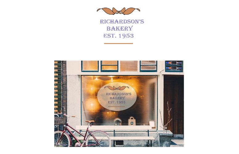
A delicious website to promote an artisan business.
Visit the Richardson's Bakery Project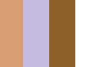
Fonts used:
- Play Fair Display
- Jost
The Brief
To create a website for Richardson's Bakery, a small high-street business in the UK. The business was looking for an online presence to encourage people to visit their physical store on the high street.
It was not designed to be an e-commerce store but rather a promotional website, that would highlight the benefits of the in-store experience and would give a preview of the products that could be purchased on visiting the shop. The purpose of the site was to establish a brand, highlight the shop's history and culture and build customer loyalty.
My Approach
This project involved, creating a website and also building a brand identity for Richardson's Bakery. This involved building the brand by creating a logo, use of colour, typography, and the tone of voice of the copy.
I established Richardson's Bakery as high-quality and artisan, with a history of operating on the high street of the small town of Melton for generations. I aimed with both my logo, gold ribbon and my typography to evoke a sense of sophistication, that reflected the brand's heritage. I used the elegant serif Playfair display, alongside luxurious colours of lavender, gold and caramel.
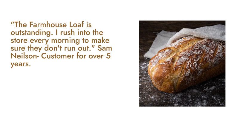
The understated design also invoked the quiet confidence of a company producing high-quality Artisan goods. Within the design and branding, addressed the brief, by reassuring visitors of the level of craftsmanship they could experience by visiting the high street bakery.
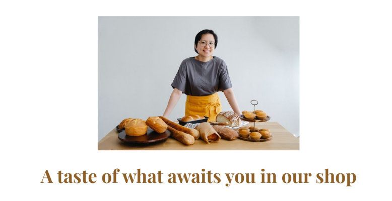
Accessibility was a key consideration within the design process this included, the legibility of the fonts, colour contrast, ease of navigation with the keyboard, detailed alt tags and considerate use of aria labels.