Typography Project
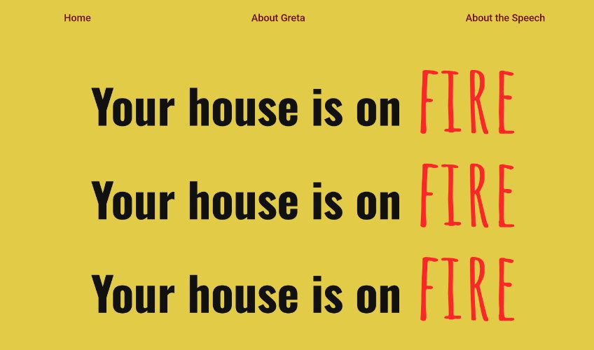
A Punkish typographic project to celebrate Greta Thurnberg.
See the Typography Project
Fonts used:
- Amatic SC
- Permanent Marker
- Oswald
- Roboto
The Brief
The brief was to create a website, to promote and celebrate a sample of a piece of literature, or a speech. It needed to include both the piece of writing or rhetoric on one page and further context in supplementary pages.
In the design of the project, it was stipulated that only typography and colour could be used (no images allowed). The typography and colour design needed to evoke the style, tone and emotion behind the writing that was being celebrated.
My Approach
For the project, I chose Greta Thurnberg's speech at Davos, on climate change, when she famously declared “Your house is on fire”. The provocative nature of the speech inspired the style and tone of the design of my website. I was heavily, influenced by the typography and graphic design of punk, and protest posters.
This led me to choose, an aggressive and bold typographic design, including fonts, such as permanent marker, which was inspired by messages scrawled on posters, which I used repeatedly in pullout quotes to emphasise certain points of the speech. I was also drawn to hazard-like, fiery reds, and bright yellows in my design, because of the speech's purpose as a warning. I wanted the design to invoke a similar sense of alarm.
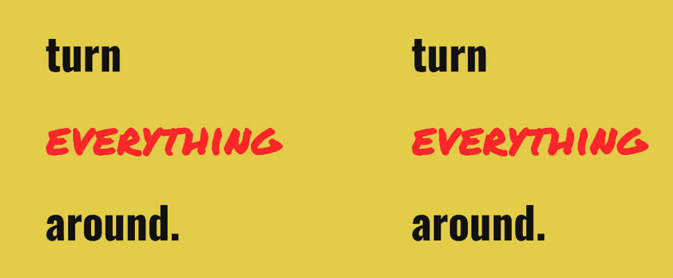
One of the techniques I used to enhance the effect of the aggressive fonts was to contrast them with serious 'report like' serifs. Oswald worked really well for this purpose. I felt these font contrasts conveyed the two dimensions, of Greta's speech, the serious conveying of facts, and the provocative use of emotional rhetoric. I also built a typographic feature, inspired by posters, around the quote “Your house is on fire, with “fire” appearing like the strands of flames.


Despite, this boldness within my design, I was always mindful of accessibility and made sure that the fonts were legible, and that colour contrast was sufficient across my design. This was quite a challenge with the reds and oranges involved and taught me how to balance provocative design and accessibility with careful planning.